Shared Ground
Services
Brand Identity
Motion Design
Web Design
Client
Shared Ground
Location
Ghent
Year
2026
Info
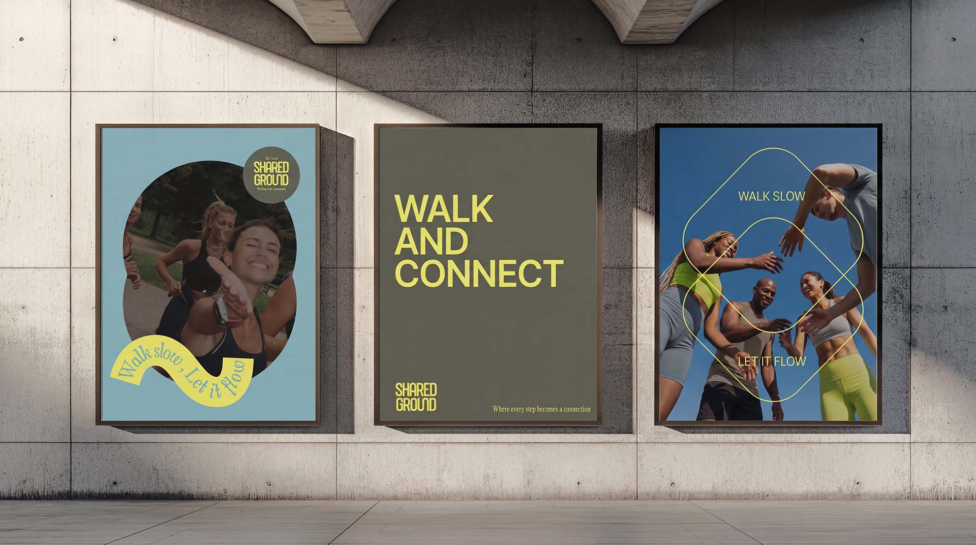
Shared Ground is a walking community built around a simple idea: connection starts at street level. In a fast paced urban environment where interactions often happen through screens, the project invites people to slow down, step outside, and reconnect with others through shared walks.The challenge was to create a visual identity that reflects this philosophy while feeling modern, urban, and approachable. The concept behind the brand focuses on movement and intersection. Different routes and different individuals come together to find common ground. This idea is translated into the logo mark through soft, flowing curves inspired by walking paths and the natural rhythm of movement. The overlapping shapes symbolize people meeting and sharing space, visually expressing connection and community.The wordmark balances confidence and warmth. It is bold enough to feel grounded and stable, while the rounded forms soften the expression and make the brand feel welcoming and human.The color palette draws inspiration from the city itself. Earthy olive and charcoal tones echo streets and urban textures, while a muted blue introduces calmness and openness. A vibrant yellow accent adds energy and optimism and reflects the feeling of movement and social interaction.Together these elements create a visual system that feels contemporary and distinctive while remaining calm and welcoming. The organic shapes extend beyond the logo into the wider identity and appear across posters, merchandise, and digital interfaces, forming a recognizable graphic language that mirrors walking paths and shared movement.Through this identity, Shared Ground communicates its core belief: walking is not about speed or performance but about presence, community, and the simple act of moving together. Every step becomes connection.